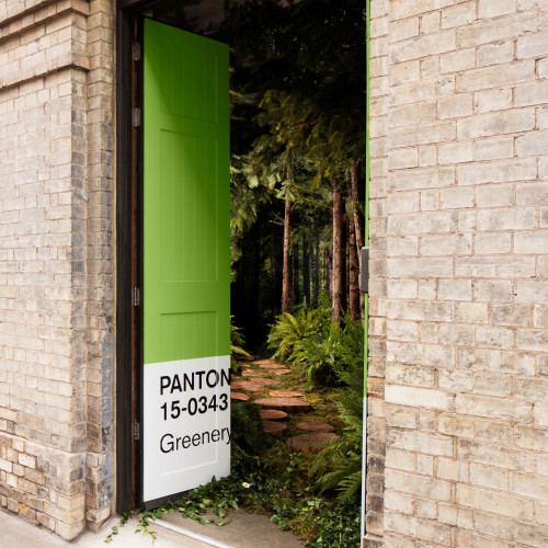
A cleverly thought out colour scheme transforms the look and feel of a room, and colour company Pantone have chosen a vibrant shade of green as their 2017 colour of the year.
Written by Carly Freestone | 16th February 2017
A cleverly thought out colour scheme transforms the look and feel of a room, and colour company Pantone have chosen a vibrant shade of green as their 2017 colour of the year.
Pushing last year’s pastel hues, Serenity and Rose Quartz, into the shade, ‘Greenery’ signifies spring and new beginnings, the arrival of hope. Described as ‘a fresh and zesty yellow-green’ by the global Colour Institute, the underlying theme of the 2017 shade is about re-connecting with our environment and bringing nature inside. Colour affects our mood, so how best to introduce the positivity and energy of this optimistic colour into our home?
If you don’t fancy painting whole walls in this vibrant colour, colour blocking is a good choice with the bold colour only used on a feature wall or area. A kitchen splashback is a perfect place for a statement colour, especially in a contemporary kitchen where a shot of colour delivers instant interest and energy. You could also give this on-trend colour a go with some bold and unexpected accessories, for example a Greenery-painted piece of furniture. Cushions, glassware and ceramics are also great subtle nods to the theme, as are houseplants which are conveniently back in fashion. Keep it simple and bring in a selection of pot plants and cacti for a fabulous visual addition to modern room schemes.
Greenery isn’t just top of the colour charts in interior design either. Pantone’s colour of the year has a huge influence on the fashion world, where Greenery is one of the hot colours for this season. While in the world of cosmetics, zesty green nail varnish and eye shadow are all the rage. It’s all about being sophisticated and on-trend without overdoing it. So why not take the plunge and embrace green for 2017? It is ‘nature’s neutral’ after all. But remember, there will be another ‘it’ colour on the block next year, so don’t go too mad.